Do you believe that a professional logo is what branding is all about? Of course not – but it is one of the essential processes whether you like it or not. You see, a great logo design means you’ve done it.
You’ve finally found your business’s face and are ready to showcase your brand identity’s visual representation.
But before you do that, there’s a thorough and lengthy process to achieve a great logo design. However, doing so is easy for those who can always hire professional designers or buy high-end logo maker software.
But to those with a limited budget, a DIY logo, or using an AI logo maker, is one of the best ways to whip up a great face for the business – and here’s how you can achieve just that!
What’s a DIY Logo Design?
With the advancements in technology and the availability of user-friendly design tools powered by Artificial Intelligence, crafting a professional logo design is much easier than ever!
DIY logo design allows entrepreneurs and business owners complete creative control over their brand’s visual identity without breaking the bank.
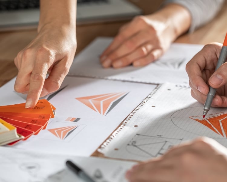
A DIY logo design is where you roll up your sleeves and dive into the creative process instead of hiring a professional graphic designer. DIY logo designs are popular today because they allow users to utilize design software, online tools, modernized features, or even a good old-fashioned pen and paper.
While it might not be as fancy as something a pro designer could create, DIY logos are charming. They’re personal and often reflect the heart and soul of your project. Plus, as we mentioned, it can be a fun and budget-friendly way to get your logo done.
Elements of a great DIY logo design
A DIY logo design is not just a random assortment of logo shapes, colors, icons, and brand names. It should be carefully crafted to see the representation of your brand’s identity and values.
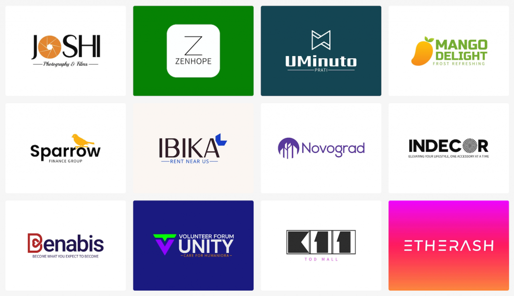
After all, a logo is one of the first things your audience will see upon visiting your brand, so you better do it right to prevent declines in the consumer buying process. Here are the elements of a great DIY logo design.
- Simplicity
Think about some iconic logos: Nike, Apple, or McDonald’s. These logos are simple yet instantly recognizable. Avoid cluttering your logo with unnecessary details or complex designs that may need to be clarified for your audience.
- Color Scheme
You also have to consider the color of your DIY logo design because otherwise, it won’t evoke the message you have for your brand. For instance, we instantly recognize fast food restaurants in the colors yellow, red, and orange, right?

Imagine if these establishments decided to change their color schemes to blue, black, or pure white – wouldn’t that remove the excitement of eating? So, colors that align with your brand’s personality and target audience.
- Scalability
Scalability is where you can patch up your logo to almost anything. Be it a sticker, mug, clothing, website, invoice, or billboard! If your DIY logo design is scalable, it can easily maintain its visual impact and be easily adaptable.
- Typography
We believe typography is “The Special Sauce” to a DIY logo design. Your font should be legible and reflect your brand’s overall style and tone.
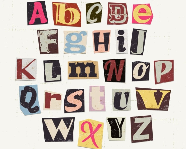
Though there are over 200,000 fonts in the world, try to experiment with different ones and consider how they complement the other elements of your logo.
- Originality
Just like anything else in this world, originality is key. Your logo should be unique and distinguishable from competitors. Avoid using stock images or generic symbols that may dilute your brand’s identity.
Instead, create a logo that reflects your brand’s individuality and stands out in the crowded marketplace.
Adding finishing touches and fine-tuning your DIY logo design
At this point, you should be proud of yourself for creating your initial DIY logo design without anyone’s expensive help! To finalize your logo, it’s time to add the finishing touches and fine-tune it to ensure that your logo looks professional and polished.
You can do this by executing two simple methods. One, knowing the importance of negative space usage, and second, taking a step back and evaluating your logo.
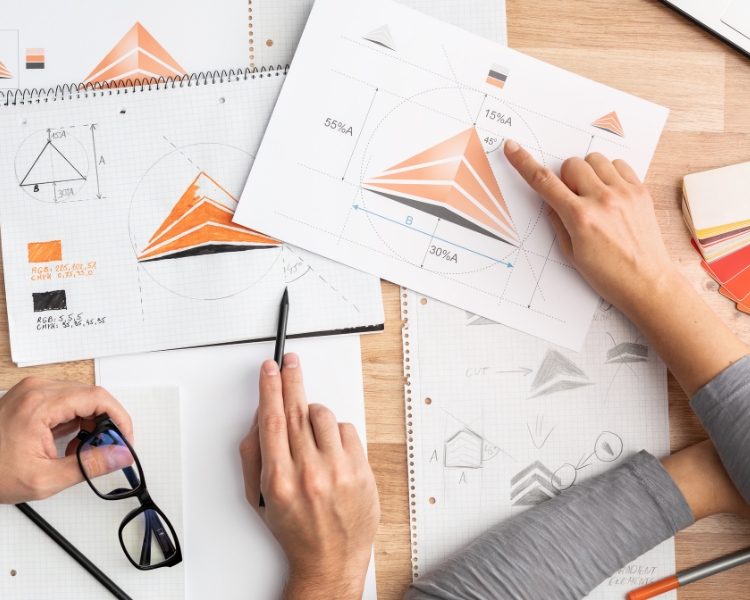
The negative space bit is where you evaluate how to effectively use negative space to enthuse memorable visual elements within your logo. Negative space refers to the empty or white areas in your logo design. So, assess where you can do more without overdoing it.
The second method is taking a step back and looking at your logo. Did you do it right? Or is there something that needs to be added to make it better? You can also test your logo across various platforms and devices to ensure it looks consistent and professional.
AI-powered logo maker tool to craft your new DIY logo design
The power of artificial intelligence truly shines through Logomakerr.AI’s innovative technology. By leveraging advanced algorithms and machine learning capabilities, the tool can generate a wide range of logo options tailored to your preferences.
Input your brand name and select your industry or niche, and Logomakerr.AI will present you with many logo designs.
And to not leave you empty-handed, the modification options with Logomakerr.AI are virtually endless! With so many icons, shapes, and graphic elements, you can confidently present your brand to the world while impacting your business.
Say goodbye to expensive design agencies and hello to the convenience and affordability of Logomakerr.AI – the AI logo maker tool that empowers you to create your DIY logo design effortlessly!
