The Johnson and Johnson logo has undergone a significant change over its 135 years in the industry. The company is known for its pharmaceutical and consumer packaged goods products and has been in business since 1886 – making them one of the strongest brands we’ve ever seen.
Johnson & Johnson truly has a time-tested legacy, and their ‘all-time logo change after 130 years’ is proof of that.
Now, since we are all talking about this logo evolution, let’s delve into Johnson & Johnson’s bold signature logo transformation from its original design to the latest look and the story behind it! And as businesses continue to evolve, tools like AI logo maker tools play a pivotal role in shaping modern brand identities.”
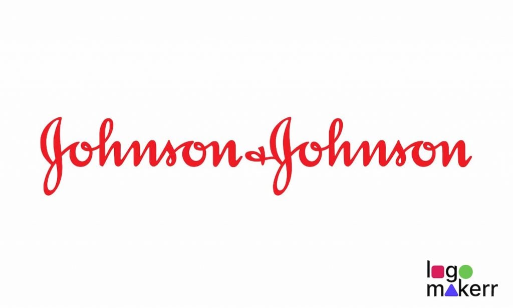
The latest Johnson and Johnson logo

Let’s start with what’s inside today before we look back. The healthcare giant Johnson & Johnson began in the late 1800s when the company was founded by the three Johnson brothers – Robert Wood Johnson, James Wood Johnson, and Edward Mead Johnson.
Their original logo featured the company name in a simple, signature script typography.
Today, after 130 years of owning, showcasing, and embracing their beloved Johnson & Johnson signature script logo, the company decided that it’s time to change fate when it comes to branding.
The logo of Johnson & Johnson now features an elegant sans-serif typography and a bit darker, calmer shade of red.
Johnson & Johnson isn’t just about making money; they’ve got a heart of gold. They’re all about giving back to the community, improving the world, and being environmentally responsible. They’re the philanthropic superheroes of the consumer-business world.
With that in mind, they began opening new businesses emphasizing baby and wound care products, high-end pharmaceuticals, and medical devices.
However, as we have seen in Nestle, which continues to thrive while being compassionate on innovation and growth, the company has a never-ending love for its logo, making it one of the oldest logos that still exist today.
Though Johnson & Johnson was originally part of the said list, the brand was removed after sealing the history with a brand-new logo design, thus leaving the story behind Johnson & Johnson’s iconic logo.
The reasons behind the changes in the Johnson & Johnson logo

There are five primary reasons why the company decided to change its logo after all these years. The reasons include:
- There’s a brand new business to show to consumers.
The old logo of Johnson & Johnson was created using the signature of its co-founder, James Wood Johnson. It has continued to appear on products, especially the brand’s baby products that we bet even you have used as a kid.
However, in light of the new circumstances, Johnson & Johnson – as a multi-company, launched a brand new business called Kenvue. The latter also offers baby products like Johnson innovative medicine as well as Johnson baby shampoo, powder, etc.
- It has been 130 years since the logo emerged.
It’s common for companies to refresh their logos periodically to stay relevant and convey a fresh image to the public.
Since the logo of Johnson & Johnson has been with the company for over 130 years, changing it can be a part of their broader corporate strategy or marketing efforts to reflect the company’s values, products, or goals more accurately.
- The old logo was ‘too old’ for the company’s’ pure-play healthcare company’ move.
We love Johnson & Johnson for its products, and we bet this company will never see the end of the line because of its moral compass called Credo. Whether it’s developing vaccines or creating groundbreaking pharmaceuticals, they’re always on the cutting edge of innovation.

But, since Johnson & Johnson is more than just their products today, the brand decided the logo of the past needed to be revised to be undertaken as a ‘pure-play healthcare company.’
- The new logo is easier to process and more memorable.
The spokesperson of this health care giant said that the new logo – with its minimalist and simpler font and color choice, is easier to process and more memorable.
More so, they stated that not all children today know how to write in cursive, and it’s just right to change the logo as the old design shows age in an era of “emojis and texting.”
- The old log is already being gradually removed from some of Johnson & Johnson’s products.
Johnson & Johnson changed their logo in the early months of 2023. Many of you might have yet to notice it, but the company is already gradually removing the old logo from its products and changing it with the new logo design.
A lot of people who patronize Johnson & Johnson products for years express mixed thoughts on the company’s bold move. Some even say that doing so is unnecessary to encompass innovation and growth. Unfortunately, whether they like it or not, the decision has been made, and there is no turning back.
Over the years, Johnson & Johnson has undergone several logo changes, each reflecting the company’s commitment to innovation and growth. From its humble beginnings in 1886, the company has consistently adapted its visual identity to align with evolving market trends and consumer demands.
Rebrand your own logo design! How?
Designing a logo can be daunting, especially for those needing graphic design expertise or a large budget to hire professional designers, unlike the healthcare giant Johnson & Johnson. That’s where Logomakerr.ai comes to the rescue!

Logomakerr.ai is a game-changing AI logo generator that empowers individuals and businesses to create stunning logos, all for free easily. Whether you’re starting a new venture, logo rebranding an existing business, or simply wanting to freshen up your logo, this innovative tool provides an intuitive and user-friendly experience for all.
With Logomakerr.ai, you don’t need to be a design whiz or invest hours learning complex software. The platform’s intuitive interface guides you through the step-by-step logo creation process!


