In a world where everything is becoming more and more complex, a minimalist logo design is a breath of fresh air. They are simple, elegant, and memorable.
This trend towards simplicity is likely due to our constantly connected world, where people are looking for designs that are both clean and easy to digest.
In this blog post, we’ll discuss more about minimalist logos and explore 15 inspirational ideas to help you create a beautiful and timeless logo for your business. Of course, we’ll also describe how you can use a free logo generator for as low as $29!

What is a Minimalist Logo?
Minimal design is essentially a creative recipe that cuts down the fluff and gets right to what you need – clean, bold, and simple logo compositions with one or two colors to create an immersive experience for your prospects with no distractions in sight.
It’s a type of logo that uses simple shapes, typography, and negative space and is often characterized by clean lines and a lack of clutter.
People are increasingly drawn to minimalist designs in a world of over-stimulation and information overload. Modern brands and businesses are immediately linked with a minimalist logo design and simplicity.
Therefore, this can be an effective strategy to represent your brand.
When to Use Minimalist logos?
When it comes to design, less is more.
But as with all design decisions, there is no one-size-fits-all answer when using minimalist logos. It will be determined mainly by many factors, such as your type of business, target audience, industry, and branding strategy.
Minimalist logos are popular nowadays among businesses who wish to project a modern and streamlined image. They’re also great for companies who wish to stand out without being too flashy or overwhelming.
Here are some general guidelines you can follow when deciding if a minimalist logo is suitable for you:
- If you want a logo that focuses on clarity and necessity.
- If your company wants to project a modern, contemporary branding.
- If you want your logo to be flexible to various mediums, including print and digital.
- If you’re looking for a simple yet eye-catching logo that will stand out from the competition.
- If you’re looking for an iconic logo that holds power that consumers will surely remember.
When it comes to design, it’s always important to consider your target audience and what will resonate with them.
A minimalist logo can be a great way to capture the essence of your brand, but it’s not always the right solution.
When Not to Use Minimalist logos?
In some cases, a minimalist logo isn’t the most outstanding choice. A minimalist logo, for example, may not be the greatest solution for a conventional organization with a more formal image, such as a law firm or accounting firm.
For some, they are particularly ineffective because it doesn’t indicate what a company do. In these cases, a logo with more elements and visual information may be better suited.
Furthermore, if you’re targeting corporations rather than individual customers, a simpler logo might not be as successful at making an impact.
Finally, if you’re trying to appeal to a more traditional or conservative audience, this logo design style could come across as overly plain or bland.
When deciding if a minimalist logo is right for your company, it’s essential to consider all of your options and weigh the pros and cons of this design style. If you’re still undecided, it never hurts to get some professional input from graphic designers.
At the end of the day, the goal is to create a logo that accurately represents your business and resonates with consumers. If a minimalist logo is the right choice for you, go for it! But if it’s not, don’t be afraid to explore other design options.
15 Minimalist Logo Inspiration (in different industries)
Minimalist logos are a popular choice for businesses that want to create a professional and polished image. They can be utilized to portray a sense of modernity and refinement.
If you’re going to design a minimalist logo for your company or product, here are fifteen terrific examples to help you get started.
01. Airbnb
Airbnb is an excellent example of a minimalist logo concept. The company uses an interesting mix of typography and iconography to create a brand known as one of the most popular and successful companies in the travel industry.
Other examples of Vacation and Travel Logo Design:
02. Apple

Apple’s logo has become an iconic symbol of technology and innovation. One of the reasons Apple’s minimalist logo works well is because it is highly versatile. It can be used in a wide range of contexts and still look professional and polished, allowing the brand to become one of the most recognizable in the world.
Other examples of Technology Logo Design:
03. Facebook
Facebook’s first logo was a simple blue square with the word “Facebook” inscribed inside. The company uses blue and white extensively throughout their branding, which is ideal for a social networking platform that wants to appear accessible and trustworthy.
Other examples of Social Media Logo Design:
04. Muji
Muji is a Japanese home good and clothing manufacturer recognized for its minimalist designs. Their logo reflects this aesthetic perfectly with a clean and sans serif, with an all-caps wordmark in English and its origin characters.
Other examples of Retail Logo Design:
05. Nike
The Nike logo is a classic example of minimalist branding. It uses a simple sans serif typeface and a minimalistic swoosh to create an instantly recognizable logo all over the world.
Other examples of Fashion Logo Design:
06. Mercedes-Benz
Another corporation that has chosen a minimalist logo design is Mercedes-Benz. The three silver stars that appear to float between the company name give the logo an exquisite and sophisticated sense that is easily identifiable by car experts and enthusiasts worldwide.
Other examples of Automotive and Transportation Logo Design:
07. WWF
The World Wide Fund for Nature (WWF) is a great example of how minimalist logo design can promote environmental conservation. The image of the panda is both iconic and memorable that works well across a variety of mediums, from print to digital.
Other examples of Nonprofit Logo Design:
08. Yahoo!
Yahoo!’s logo is great evidence that a minimalist logo design can last over the years. The company’s signature yodel logo has been used for over twenty-eight years and is still highly recognizable today, while the exclamation point not only adds visual interest, but also creates a sense of excitement and fun that reflects the company’s brand identity.
Other examples of Search Engine Website Logo Design:
09. Spotify

Spotify is one of the most popular music streaming services in the world. The logo is modern and sleek, with a simple typeface and bright green color that pops against its black background.
Other examples of Music Logo Design:

10. KFC
The iconic Colonel Sanders is probably one of the first things that come to mind when thinking about KFC. The classic red background with a simple white font is distinctive and timeless. It’s no wonder why this minimalistic logo has been around for so long.
Other examples of Food & Beverage Logo Design:
11. IKEA
IKEA is known for its modern, minimalist designs, and its logo is no exception. The yellow text against a blue background is both eye-catching and cohesive.
Other examples of Interior and Architecture Logo Design:
12. Marriott Hotel
The clever use of the hotel chain’s letter “M”s creates an interesting visual impact. At the same time, the dark red color and an unusual font with short serifs typeface are both clean and sophisticated.
Other examples of Hospitality Logo Design:
13. Chase Bank
Chase Bank’s minimalist logo uses a clean, simple typeface combined with the four parts of the octagon and a square in the middle to create a distinct and professional look along with its blue and white color palette.
14. McKinsey & Company
McKinsey’s minimalist logo combines simple typography and a blue identity set against a white background to break through all the design noise and elements.
Other examples of Consulting Logo Design:
15. Canon
Canon’s minimalist logo is sleek, modern and professional. The use of both a small sharp serifs at the top of the letters and a red-and-white color scheme gives the logo an authoritative feeling and represents the brand well.
Other examples of Photography Logo Design:
Should You Consider a Minimalist Design?
Minimalist logo is a trend that has been popular for years, and it’s not going anywhere anytime soon.
From logos to clothing brands to digital marketing strategies, minimalism will always be an effective means of attracting the attention of today’s tech-savvy consumers through a well-designed typography, icon, and overall image.
Are you interested in learning more about how your company can benefit from this design style? Let us know!
Our experts are eager to work with you to develop a superb branding strategy that generate sales by considering your needs and preferences in designing the perfect minimalist logo design for your business!
However, keep in mind that not every business is suited to a minimalist design, so do your research before making any decisions.
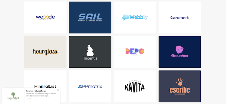
If you decide to go with a minimalist logo, you can start by choosing one of the minimalist logo templates available from an AI logo maker like Logomakerr.ai. Just change the business name and make minor edits to the color, fonts, and symbols to make it yours in just minutes.
