A logo is more than just a symbol of your brand—it is an extension of it! Your brand logo represents what you stand for and what makes you different from all the other companies. That’s why it’s crucial to get the logo design right.
And while some creators of logo designs stick to the basics of design when crafting a “classic” logo with “safe” logo features, some go above and beyond the task at hand.
They painstakingly collaborate with their clients and make suggestions to create clever logos with hidden meanings. Let’s discover what it means, and view some examples along!

Why Use Logos with Hidden Meanings?
Logo designers deliberately incorporate these hidden messages into the logo designs. “For what purpose?” you may ask.
Logos with hidden meanings add a layer of intrigue and up consumers’ interest level for the brand. A logo design with a hidden image will likely generate more revenue than one without.
Do all logo designs have hidden messages? Maybe not.
However, companies that decided to go for logo designs with hidden messages probably wanted people to remember them for what they offered and what they stood for.
Brand Logos with Hidden Meanings
What’s impressive about these clever logo designs with hidden meanings is that the secret symbols typically hold a special significance for the brands they represent. For instance, consider the logo design for Pittsburgh Zoo.
The logo design for Pittsburgh Zoo depicts a massive black tree in the middle. The white or negative spaces it creates shows a hidden image of a gorilla and a lion facing each.
And if you look close enough, you’ll see two frolicking fish at the bottom. Who would have thought a zoo logo could be rife with hidden meanings?
Another simple logo design with a touching hidden meaning is the one for Hope for African Children Initiative. At first glance, you’ll see the shape of the African continent on the negative space.
However, looking closely, you’ll see the outline of a young child and an adult. It is a testament to how the Hope for African Children Initiative aims to help African children.
The Goal of Logos with Hidden Meanings
Logos with hidden meanings typically have dual meanings–brand representation and hidden meanings. Hidden symbols in a logo design tell a story, as the Pittsburgh Zoo logo proves, that it is an optical illusion. There are countless other brands having logos with hidden meanings.
Continue reading below for logos with hidden meanings.
20 Logo Designs with Hidden Meanings
Logo designs with hidden meanings are a popular trend in graphic design. Here are some examples of logos with hidden meanings:
1. Amazon

The Amazon logo design is a classic example of a logo with a hidden meaning. The logo features a yellow arrow beneath the letter “A,” pointing towards “Z.” It conveys the hidden message that Amazon sells everything from A to Z.
2. FedEx
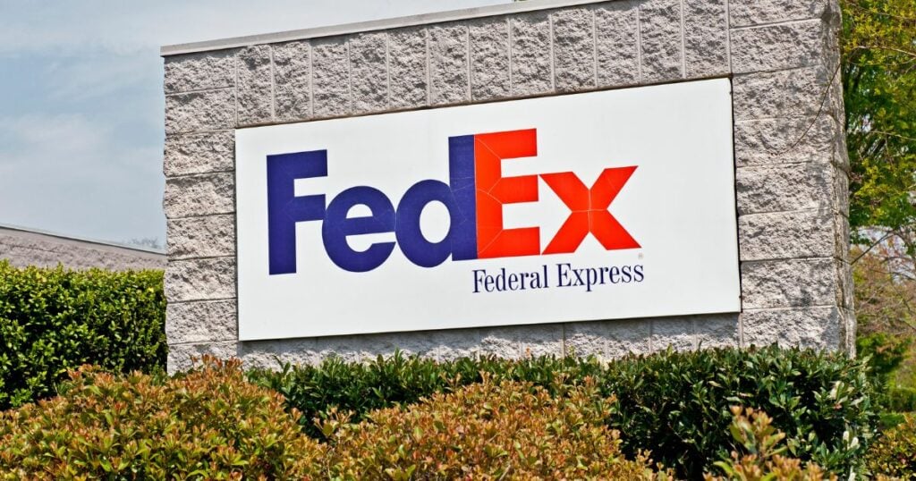
Upfront, the FedEx logo appears to be “just letters,” but no, it is another well-known logo with a hidden meaning. If you look closely at the logo, you’ll notice that the white space between the letters “E” and “X” forms an arrow. This arrow represents speed and precision, essential qualities for a shipping company.
3. Toblerone
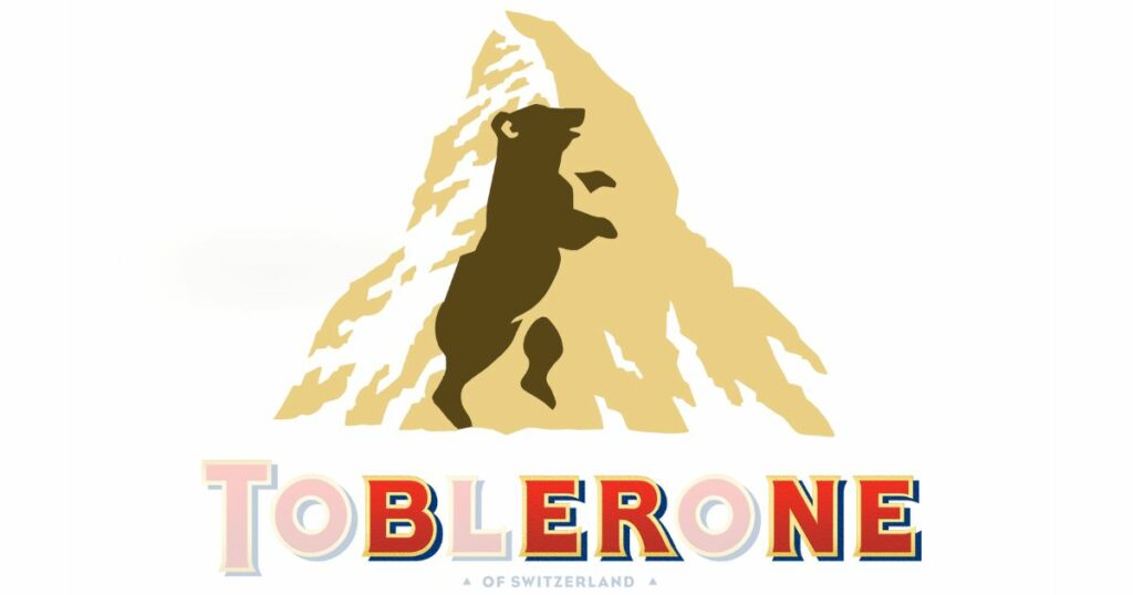
Toblerone’s logo features a mountain with a distinctive triangular shape. Looking closely at it, you’ll realize the Toblerone logo shows a bear inside the mountain’s outline. The bear represents the city of Bern (also spelled Berne), Switzerland, where Toblerone originated.
Incidentally, the letters that spell “Toblerone” also contains the alternate spelling of Bern.
4. Baskin-Robbins
Baskin-Robbins’ beautiful logo is known for its bright colors and fun design, but there’s more to it than meets the eye. If you look at the logo, you’ll notice that the number “31” is hidden within the letters “BR.” This pretty cool logo mark indicates that Baskin-Robbins has 31 flavors of ice cream on its menu.
5. Toyota
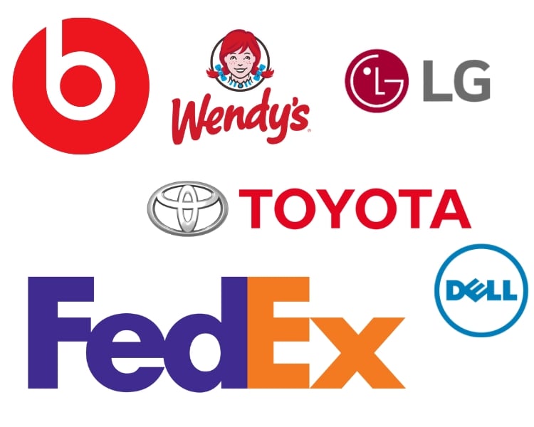
The Toyota logo is among several car logos with hidden meanings. At first glance, the logo denotes a simple yet effective design of three interlacing oval rings. These ovals represent the company’s three main divisions: Toyota, Lexus, and Scion.
Additionally, the designer arranged the ovals to form the letter “T,” which stands for Toyota. Moreover, the rings represent the overlap between the company’s products and consumers.
6. NBC
The list of logos with hidden meanings usually includes the NBC logo, and it’s one of the best logos with hidden symbols. The logo is a classic design that has been around for decades featuring a colorful peacock with its six feathers spread out.
Each one is a different color, and the feathers represent the various divisions of NBC. Additionally, the peacock is facing to the right, which suggests that the company is always looking forward.
7. Apple
The Apple logo is one of the most recognizable logos in the world, but many people don’t know its hidden meaning. The logo shows an apple with a bite taken, representing knowledge and enlightenment. Additionally, the apple bite is a nod to the story of Adam and Eve, tempted by the fruit of the Tree of Knowledge.
8. Beats by Dre
The Beats logo shows a lowercase “B” inside a white circle. The white circle aims to resemble a person’s head wearing headphones. And while the logo design has hidden elements, part of the mission is to give it a more human aesthetic.
9. Cisco
Cisco, a worldwide leader in information technology (IT) and networking, is headquartered in San Francisco, California. In its early years, the company’s engineers used small letters to render the brand “cisco” since it’s a derivative of the city’s name. Being an IT and networking company, you would think they would go for a digital signal or binary code for its logo, but no.
Cisco’s logo design includes blue stripes above its wordmark that look like an analog wave, but those are signal waves and electromagnets that depict what the company stands for. However, the logo design also shows the Golden Gate Bridge, a staple landmark for which San Francisco is known. This logo design element adds an extra layer of meaning that ties the brand to its place of origin.
10. LG
LG’s logo design also has a hidden meaning that is not immediately apparent. The red symbol next to the letters “LG” appears to include those letters in the middle, but placing these letters within a white block circle creates the image of a face. This logo design choice makes the brand appear more friendly and approachable.
11. Continental
Continental’s logo design cleverly uses typography to create a hidden meaning. The “O” from Continental is placed within the “C” to make the shape of a tire, drawing attention to the brand’s product portfolio.
12. Wendy’s
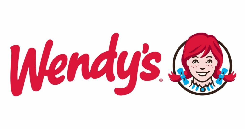
Wendy’s logo design contains a hidden message that is easy to overlook. The details of the neck area of Wendy’s dress spells out the word “mom” to emphasize the family nature of the restaurant and its commitment to a “home-cooked” fast food experience.
13. Dell
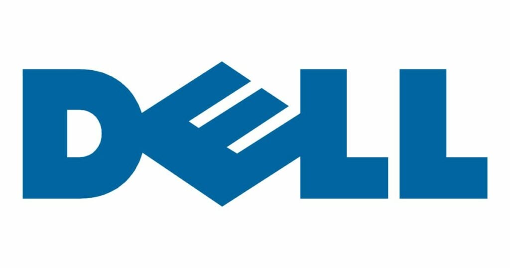
Dell’s logo design tilts the “E” to its side to represent the company’s approach to changing the technology landscape by “turning the world on its ear.” Can you think of a cooler way to use a logo design to express your company’s mission statement?
14. Le Tour de France
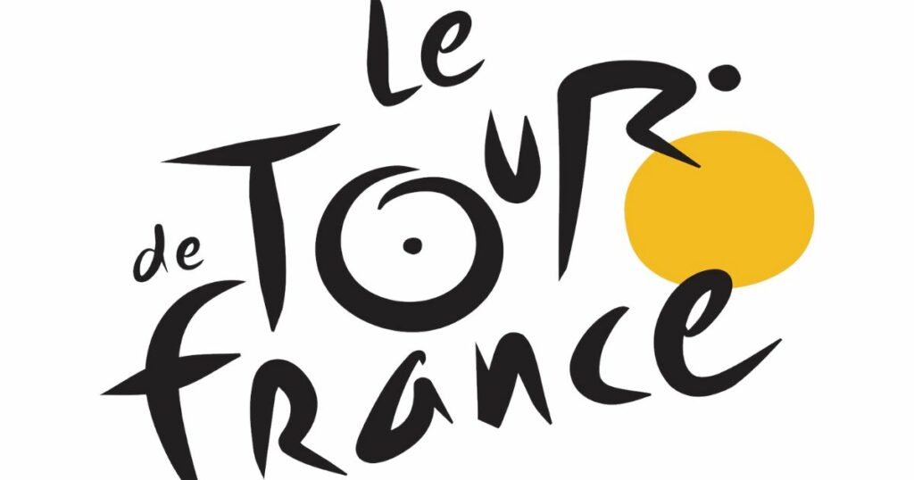
The Le Tour De France logo design is instantly recognizable to cycling enthusiasts but contains hidden meanings. The style of the letters in the wordmark creates the image of a bike, and the “O” in the word tour represents a wheel, while the “R” looks like a cyclist. Could the logo design of Tour De France be even more clever?
15. Hyundai
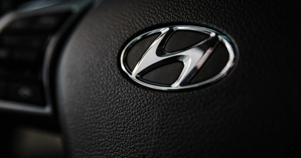
Hyundai’s logo design is a silhouette of two people shaking hands, representing the mutually cooperative agreement between the company and the customer. The negative space that completes the logo design is a simple “H” representing the brand.
16. Tostitos
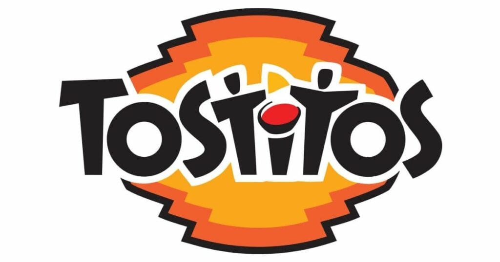
Are you in the mood for some serious salsa dipping? Before you do that, look at your bag of tortilla chips, paying particular attention to the Tostitos logo design. You’ll notice that the brand name’s second and third “t” are just as eager as you to dunk a chip in yummy salsa.
17. Hershey’s Kisses
There’s no question about the delectable goodness of a Hershey’s Kiss. However, have you checked out its ingenious logo design? If you look closely at the space between the letters “K” and “I,” you’ll see an unwrapped piece of Kiss turned on its side.
18. Museum of London
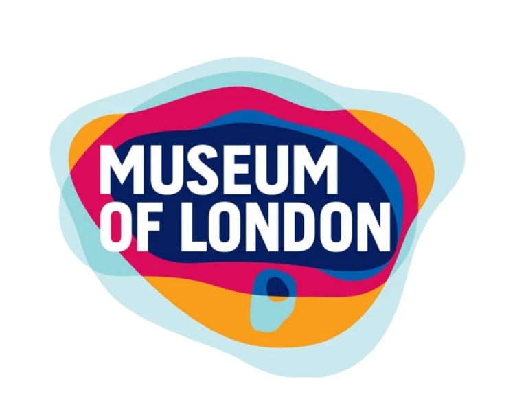
It takes the cake when it comes to logos with hidden meanings. Initially, the logo design looks like just abstracted blobs. Nevertheless, each colored layer (there are six of them) represents the different boundaries of London as they evolved throughout the city’s history. What a great way to fuse history and brand representation in one logo design, right?
19. Yoga Australia
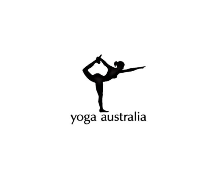
The negative space points your eyes toward a woman striking a perfect yoga pose on the simple logo design of Yoga Australia. However, looking closely, you’ll see the secret symbol formed by the woman’s bent knee, which she holds in her hand. The white space created shows an outline of the Australian continent.
20. Goodwill Industries
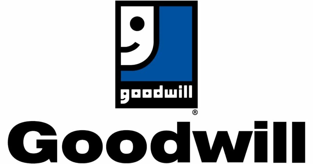
Most non-profit organizations have logos with hidden meanings. The logo design of this American non-profit organization is no exception, although it looks ordinary at first glance.
It shows a smiley face, likely representing the organization’s overall feeling after helping improve countless Americans’ lives. However, looking closely, you’ll see that the smiling face is also a small letter “G,” obviously standing for “Goodwill.”
Indeed, logos with hidden meanings can be a fun way to add depth and meaning to a company’s brand identity. From the Amazon arrow to the Toblerone bear and the woman in Yoga Australia to the Pittsburgh Zoo, these logo designs capture our attention and creatively convey a message.
6 Bonus Logo Designs with Hidden Images
Other brands have taken the rendering of their company name to the next level. Whether these logo designs have hidden images or hidden meanings, you’ll enjoy learning about them:
- BMW – its current logo design proudly shows the colors (blue and white) of the Bavarian flag, with Bavaria being the company’s home state.
- Northwest Airlines – its logo design shows a red circle with a triangle and the letter “N” inside. The arrow points to a northwest compass direction. Nevertheless, if you look closely, you’ll see that the arrow combined with the letter “N” creates the letter “W” on the negative space, which are the first two letters of Northwest Airlines’ acronym (NWA).
- Adidas – the three stripes synonymous with the brand are icons symbolizing a mountain. The logo design represents a mountain and denotes challenges and goals people must overcome.
- Audi – the four interlocking rings of the logo design symbolizes the four companies that merged into one (Auto Union, eventually becoming Audi) – Audi, DKW, Horch, and Wanderer.
- Magic Coffee – its logo design looks like a coffee cup and a magician’s top hat. It’s called Magic Coffee because of its particular proportions that produce magical coffee flavors.
- Flight Finder – its logo design has two hidden meanings. You’ll find the letter “F” mirroring itself to create the outline of an airplane, which is what Flight Finder is all about.
There are hundreds more logos with hidden meanings and secret symbols ranging from sports teams to equal signs or a simple orange circle or a yellow circle. The logo design could resemble a map pin or describe an NHL team, and it could be the Pinterest logo, Sun Microsystems, or the logo design for Spartan Golf Club.
It could be any logo design. However, two truths stem from logos with hidden meanings.
By understanding the hidden meanings behind these logo designs, you can gain a deeper appreciation for the thought and creativity that goes into designing them. You will also realize that logos with hidden meanings play a significant role in a brand’s impact on people’s lives.
Why not try, and make one today? Logomakerr.AI (an AI logo generator) has every element and easy-to-use tools you can use to create a logo and customized them on your own preferences and needs. Whether this means you’d love to create a logo with an ‘obvious’ meaning, or a hidden one.
