Have you seen this type of font before?

If you’re a font buff, you’ve likely heard of Arial font – a widely used typeface in graphic design.
Arial is one of the most popular fonts in the world and is often considered the go-to font for graphic designers. It’s clean, easy to read, and versatile enough for various projects, including headlines, logos, and other visual design elements.
But besides these reasons, why is Arial such a popular choice? And what makes it so well-suited for graphic design?
Let’s take a closer look!
What is Arial, and What Makes It Different?
The Arial font is a sans-serif font designed for screen and print use. It was created in 1982 by two notable designers, Robin Nicholas and Patricia Saunders, to be a sans-serif font that could be both visually appealing and easy to read.
You might be familiar with the font, Helvetica. These two fonts are typically considered the same because of their similarities, like they don’t have the little flourishes at the end of some letters like serif fonts.
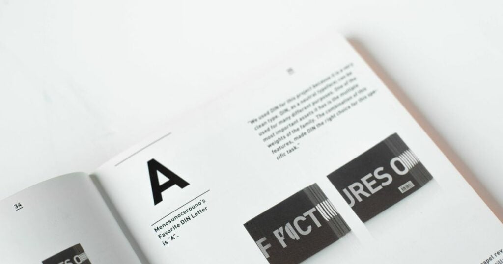
It is indeed an incredibly versatile font due to its range of weights and styles. It can be used for various projects—from body text to headlines—and it still looks professional.
And since it was explicitly designed for screens, it is legible even at small sizes and text-heavy documents, like books and magazines, as well as logos, signs, and other branding or advertising materials.
In fact, many big companies have prioritized this font over the past few decades – from Office 2007 to Mac OS X.
What Makes Arial Popular Among Graphic Designers?
Below are a several noteworthy points that tell why every designer is after this font.
1. The Core Font On Microsoft
Do you know one of the primary reasons behind this font’s popularity? Arial is the core font of Microsoft, made freely available through Microsoft, and quickly became the go-to choice for many graphic designers.

Arial quickly gained a reputation as a classic typeface that was simple yet sophisticated. Nowadays, it is widely used by designers and endlessly updated to stay current and appealing to all sorts of audiences – making it a perfect choice for websites and documents in this digital age.
Its popularity has grown so much that Google even offers its version – Roboto – in its library of fonts, making it easier than ever for people to access a typeface that looks just like Arial!
2. Easily Readable Font – Even from Distance!
Arial font has a special place in a designer’s heart!
It is a favorite amongst professionals because of its legible nature – whether a logo is printed on a pen or a billboard, Arial makes reading the words easy and comfortable.
This font has an open design, while the strokes are also natural. Each character and letter is visible, so the reader can distinguish what you are conveying from a distance.
This is also why Arial is one of the most popular choices for any design element. It maintains clarity regardless of size, allowing designers to scale up or down without sacrificing a great visual experience. Its versatility and functionality will surely smile on any designer’s face!
3. It Belongs to the Sans-Serif Family
Arial font is a popular choice within the sans-serif family, a typeface that doesn’t use serifs or small lines at the end of a letter. Its neat and rigid lines work well on-screen, creating a smooth look pleasing to the eye.
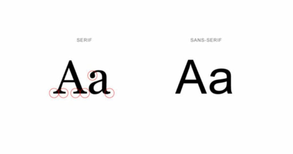
Moreover, this modern font can fit different products like papers, websites, business cards, flyers, and more! Definitely a font that won’t go out of style.
4. Convenient Font to Use and Read Anywhere
What makes this font worth using is its convenience to all the designers. You do not have to modify any character – let Arial do its job!
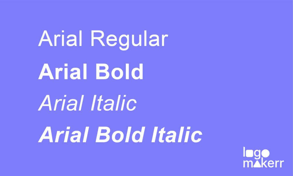
Its neat look makes it convenient for reading on basic monitors or high-definition screens, allowing only a few adjustment tweaks as needed. Plus, Arial font has a wide range of letter weights and styles, from regular to bold and italicized.
Best of all, most word-processing programs have this font available, so you don’t need to worry about downloading anything special.
5. It’s Great For Digital Use
Arial looks beautiful on screens, both large and small, giving a professional and polished finish to any project. Its simplistic lettering structure makes it a favorite amongst various age demographics and allows you to create readable digital content easily.
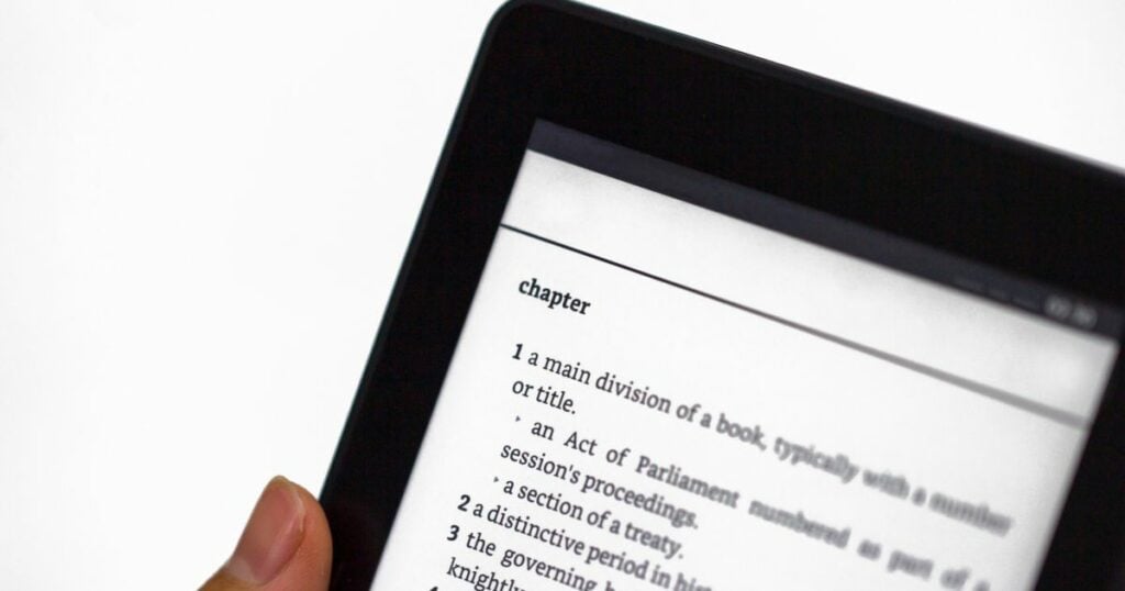
Arial font also comes in a wide range of sizes – a perfect solution if you need to fit a lot of text into a smaller digital footprint. It’s also one of the fastest fonts to load when viewed on a website.
An all-around winner, Arial font offers a stylish and reliable solution for several different applications – a perfect go-to for any designer.
6. A Safe Option For Every Medium
This classic, bold typeface is a contemporary classic and a go-to choice for brand consistency, making it a safe option. It has wide language support with over a hundred characters in different languages.
Its crisp lines and clean letterforms make it preferred for digital and printed materials, providing you with a well-balanced typeface no matter the project. There are also tons of other san-serif options that are readable and understandable, but no one can match the level of Arial.
7. It Has A Human Touch
Have you heard about humanist fonts? Arial font has a natural human touch due to its neutral, well-spaced characters that are gently curved but not overly ornate. It provides a subtle yet accessible feel, perfect for various applications.
Arial is a default option on practically every platform, making it incredibly convenient. Whether you’re creating a newsletter, website, or presentation – Arial font offers a pleasing blend of comfort and professionalism to ensure your words get the recognition they deserve!
8. Timeless Quality
Arial Font is a popular font choice, and it’s easy to see why that is.
Its clean lines, distinct letters, and timeless quality make it a go-to for various uses. Plus, Arial Font often takes up less file storage space than other fonts – a great advantage when working with multiple documents!

Many graphic designers also love to use Arial Font because of its versatile look; depending on the size and color, it can give a classic or modern feeling.
9. It’s Versatility Is Incomparable
Versatility is another worth mentioning attribute of this Arial since it comes from a large sans-serif family that designers have used over the years.
Arial font is no exception; its family includes many styles like Arial narrow bold italic, Arial narrow italic, Arial bold italic, Arial light, Arial medium, Arial black italic, and many more to mention!
With several options among the Arial font family, you can easily find a style perfect for creating any document or presentation!
Will Arial Be Your Go-to Font?
Arial is a timeless font that has been popular among graphic designers for decades. It has great clarity and readability, making it an excellent choice for designers who want to create clean and legible designs.
That’s why we made it available for you at Logomakerr.AI.
Our AI logo maker has the exact attribution of versatility as it can be used for a wide variety of design projects, from web design to logo design.
Give it a try next time you need a sans-serif typeface!
