
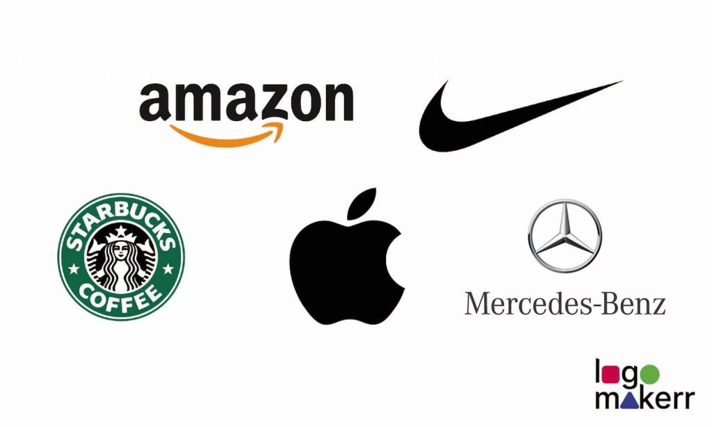
Think of the most iconic brands – Apple, Nike, Starbucks. You would still know them instantly even without their names. That is the magic of a well-chosen symbol.
A logo is more than decoration. It means a visual shortcut to your brand’s story, values, and promise.
But how do you pick a symbol that not only looks good but also resonates and lasts? This article breaks it down. First, uncover the hidden meanings behind famous logos, and then explore ways to make your brand stand out.
Why Symbols Are More Than Just Pretty Pictures
A symbol is like your brand’s signature, which communicates in seconds what paragraphs of text cannot. Done right, it sparks trust, emotion, and recognition. Done wrong, it fades into the sea of forgettable logos. Even modern digital platforms like the Nebula app rely on simple yet meaningful visuals to build recognition in crowded markets.
The best way to learn? Take a look at the giants who have mastered the art.
Deciphering Meanings of Famous Logos
Apple: Simplicity with Depth
The bitten apple is the most recognizable symbol now. Though a pretty simple visual, it carries multiple layers of meaning. The emblem suggests knowledge and discovery, echoing the focal biblical fruit. At the same time, the bite makes it human and prevents confusion with other round fruits. Apple’s logo is a masterclass in making a complex idea playful, minimal, and instantly tied to innovation.
Nike: Motion and Victory
The swoosh isn’t random. Inspired by the wing of the Greek goddess Nike, it symbolizes speed, movement, and victory. These meanings perfectly align with the key company’s mission to empower athletes. The bold simplicity ensures efficacy in any size or format, while the curved shape conveys energy and dynamism.
Starbucks: Myth and Storytelling
Why a siren for coffee? It might seem a strange choice at first sight. Still, this mythical sea creature symbolizes allure, mystery, and a sense of journey – qualities Starbucks wanted to tie to its global coffeehouse experience. The logo’s layered symbolism pulls customers into a lifestyle rather than just a drink.
Mercedes-Benz: Balance and Ambition
The three-pointed star in the Mercedes-Benz logo moves beyond sleek design. It speaks volumes company’s dominance on land, sea, and air. The timeless, geometric perfection projects prestige and engineering excellence. Symbols like this show how abstract forms can hold deep meaning when linked to a brand’s values.
Amazon: Customer Promise
Amazon’s wordmark is plain, but the arrow-shaped smile beneath it adds depth. Stretching from A to Z, the arrow conveys that the company sells everything, while the smile indicates customer satisfaction. This clever double meaning makes the logo memorable and directly associated with the brand’s promise.
How to Get the Right Logo Symbolism
Many consider that a meaningful logo costs an arm and a leg. In fact, you don’t need a billion-dollar design team to choose wisely. The process only requires clarity, creativity, and strategy. Here are practical steps to guide you to spiritual symbols that feel timeless and unforgettable:
Start with Your Brand DNA
Before thinking about a catchy design, define what your brand stands for. Reflect on:
- Values you’d like to represent
- Your competitive edge
- Emotions you want to trigger
- Your ultimate promise to customers
Your logo symbol should be the visual distillation of these answers.
Draw Inspiration from Universal Symbols
Humans have long associated shapes and icons with meaning:
- Circles – unity, community, continuity
- Triangles – growth, stability, direction
- Stars – ambition, achievement, aspiration
- Animals – wisdom (owl), strength (lion), speed (cheetah)
Opt for those elements that transmit your brand identity and key narrative.
Keep It Simple
The best brand symbols are minimal yet impactful. They work on a billboard, a website favicon, or even as a tiny app icon. Overly detailed or complex images can lose clarity when resized. Aim for clean lines and bold shapes.If you’re unsure how to strike this balance, using an AI logo maker can help you quickly explore simplified versions of your design that remain versatile across all platforms.
Balance Uniqueness with Familiarity
The idea is to find the sweet spot. You should be original enough to differentiate, but not too abstract to confuse people. A fintech logo could lean into geometric precision, while a wellness brand might embrace natural designs. Familiar references help audiences connect faster.
Test Emotional Resonance
A logo isn’t just about contemplating – it’s about feelings. Share drafts with your target audience. Ask what emotions or associations come to mind. Do they experience excitement, calm, trust, or nothing at all? Their first reaction matters more than design theory.
Think Long-Term
The truth is that trendy designs fade as quickly as they light up. So, it is worth acquiring an emblem that can evolve subtly but won’t take a complete overhaul every few years. For example, Apple’s logo has barely changed in decades, while many forgettable startups vanish with their flashy symbols. Timelessness is a hallmark of great logos.
Ensure Versatility
Your logo will live everywhere is a fact – on websites, business cards, product packaging, merchandise, or maybe even billboards. To avoid poor visibility, test how it looks in different colors, backgrounds, and materials. A truly effective logo is adaptable.
When you define your essence, lean into timeless symbolism, and keep your design minimal yet powerful, your logo becomes more than an image. It turns into your brand’s legacy.
Conclusion
Your logo symbol serves as the core element which represents your brand identity. A well-selected symbol will survive beyond trends while transcending cultural differences to establish your business in the memories of your target audience. Your symbol should represent your brand values through either classic iconography or original creation while creating instant brand recognition. Your silent ambassador works continuously to represent your brand even when you are absent from the scene.