Logos are a big part of a brand’s identity. They can tell a story, create a connection, and make a lasting impression. That’s why a logo redesign can be a game-changer. In fact, 78% of consumers say a logo is a work of art when done right.
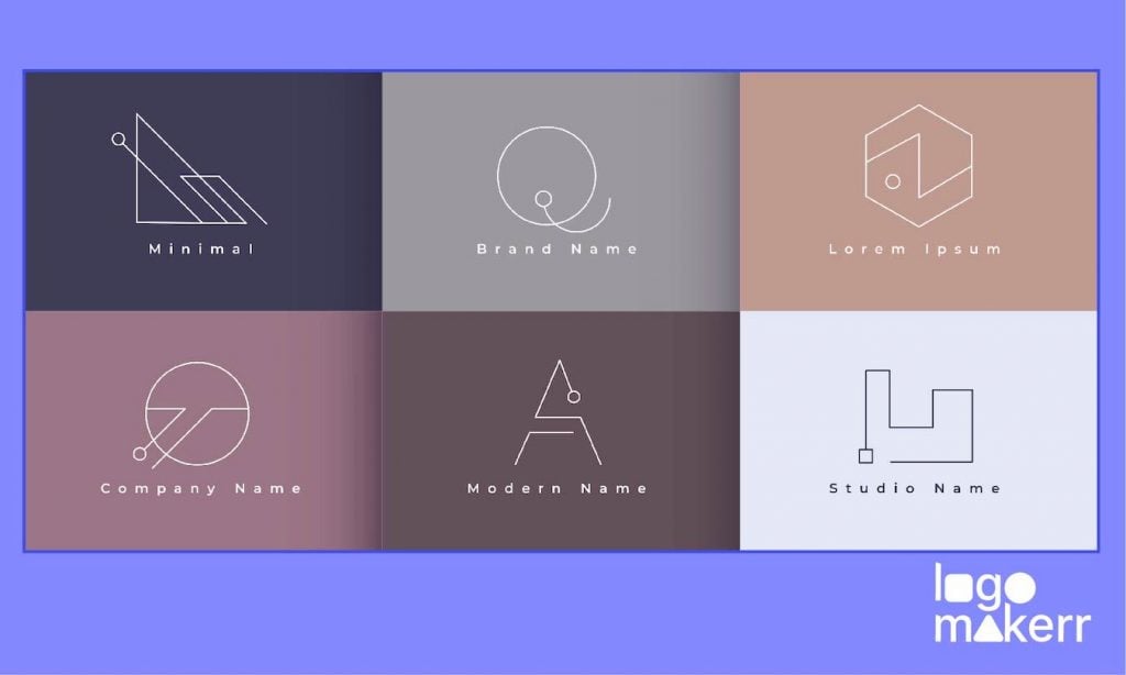
But remember – logo redesigning is not for everyone! So, we suggest that you create a logo mockup first using free logo generators or simple logo maker AI before you put your business’ brand identity to stress!
In this blog, we’ll take a look at the 8 best logo redesigns that have captured attention and made an impact. With this, you can see whether logo redesigning is for your brand or it’s only something you can do in the future.
Here are the 8 Best Logo Redesigns you can take inspiration for
Redesigning a logo isn’t just about making it look nicer; it’s about showing that the brand is growing and changing. Maybe they want to attract younger people, update an old look, or show a new direction for the company.
A good redesign website can change how people see the brand and make it more valuable – not that your company’s profit might need it, but because your audience needs to see something new once in a while.
So, here are the 8 Best Logo Redesigns you can take inspiration for if you decided to change your entire brand identity!
1. The Apple Logo
The Apple logo started in 1976 with a complicated design of Sir Isaac Newton under an apple tree, representing the company’s name and its focus on knowledge and discovery.
Apple co-founder Ronald Wayne designed this detailed logo, but it soon became obvious that it was too complex for everyday use, especially in smaller sizes.
Today, the logo was simplified to a sleek, one-color design. This modern look matched Apple’s move toward a more minimalist style, fitting perfectly with the clean lines of their new products. The glossy black version became a symbol of sophistication and high-tech innovation, reinforcing Apple’s position as a leader in the tech industry. If you want to create a logo like this, taking a look at different logo generators will work for you.
2. The Nike Logo Redesign
No one can ever forget the Nike logo we know today.
Designed in 1971 by graphic design student Carolyn Davidson, this simple swoosh shape had mixed reactions at first. But over time, it has become a powerful symbol of athleticism, excellence, and empowerment.
What we like most about the Nike Logo Redesign is they made a bold move by using just the Swoosh without any text. This showed they were confident in their logo’s strength.
3. Starbucks
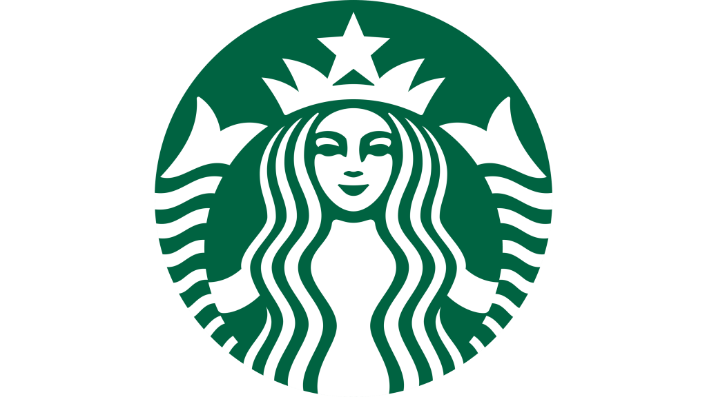
When Starbucks first started in 1971, their logo showed a detailed picture of a mermaid with two tails, surrounded by the company’s name in a sea-themed font. This design was meant to capture the spirit of the sea, which connected to Starbucks’ Seattle roots and their focus on great coffee.
But today, Starbucks logo redesign is more than that.
The new logo focused on the siren’s face and flowing hair, putting her inside a clean, green circle. They removed the text around her to make the design more modern and striking – which is definitely better if you ask anyone around here!
4. Pepsi – a bold logo redesign
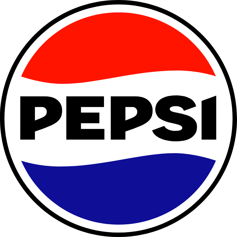
Pepsi started with a basic logo that just had the product’s name in a traditional font. As the drink industry got more crowded, Pepsi realized it needed to do more than just be noticed; it needed to make a big impact.
This is the sole reason why Pepsi had one of the boldest logo redesigns.
Most recently, in 2014, Pepsi rebranded one more time, opting for a cleaner, flatter design that harkened back to its roots while still feeling fresh and contemporary.
5. Instagram
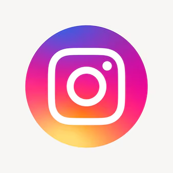
Instagram made news with a logo redesign that changed how people saw the brand. The old logo, a cute, old-fashioned camera, reminded people of the early days of photography and brought a feeling of nostalgia. But as Instagram grew from just a photo-sharing app to a big social media platform, it needed a new look to match its modern identity.
6. Airbnb Logo Redesign

In 2014, Airbnb shook up the branding world with its new logo, called the “Bélo.” This wasn’t just a new design; it showed how Airbnb wanted people to see them. The Bélo is a clever symbol that brings together different ideas to represent Airbnb’s main values and mission.
Although this sounds serious and uncool for some Gen Z’s, Bélo resembles a stylized heart—representing the warmth of hospitality and the sense of belonging that Airbnb aims to foster among its users!
7. MasterCard
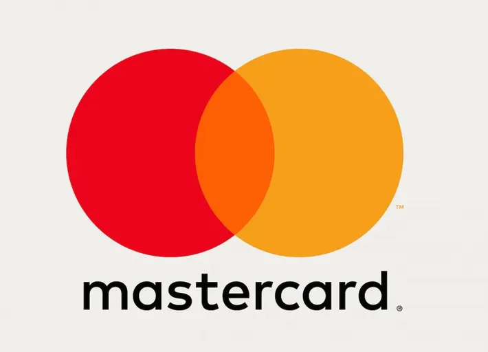
MasterCard’s logo redesign was a big moment for the brand.
And here’s why.
In 2016, they introduced a new, simpler look that appealed to a younger audience. The logo kept the familiar red and yellow circles but removed the extra details and text. This made the symbol sleek and easy to recognize.
Here’s a simpler version: — The new logo came with a new tagline, “Start Something Priceless,” which highlighted the brand’s focus on connection and value in a busy world. With a clean and modern look, MasterCard updated its image and showed it was a forward-thinking leader in finance – and we bet everyone can agree with that!
8. Google
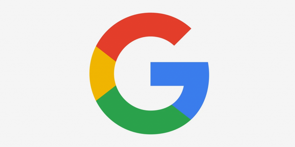
When it first came out in 1998, the Google logo was a simple, colorful wordmark that looked friendly and fun. It was easy to understand but didn’t have the energetic style the brand would later become known for.
By 2010, Google made a big change by adding “doodles” to its logo. This turned the logo from a fixed design into a lively and changing canvas.
In fact, a lot of users likes to wait for Google’s doodle logos because it convinces everyone what is currently happening in the world.
Today, when we think of Google, we think of more than just a search engine; we think of a brand that brings joy and knowledge to its users in unexpected and delightful ways.
Final Thoughts
Ready to give your logo a fresh new look?
Create your logo redesigns and mockups today using an AI logo maker like Logomakerr.ai.
With its easy-to-use tools and advanced technology, you can design a professional and eye-catching logo that perfectly represents your brand. Start transforming your ideas into stunning visuals and make your brand stand out from the crowd!
We hope this journey through design has inspired you to appreciate the thought and strategy behind each logo. Now, we want to hear from you! Which redesign captivated your attention the most? Share your thoughts in the comments below, and let’s celebrate the art of branding together!