When building a brand, a logo design is an essential element that can significantly impact how the public perceives your company – and avoid logo design mistakes as much as possible.
A famous quote from Paul Rand: design is the silent ambassador of your brand. A well-designed logo can effectively communicate your brand’s values, message, and personality, while a well-designed logo can turn potential customers away.
Creating a logo is more complex than combining images and text. People make several common mistakes when designing a logo that can affect its effectiveness.
Let’s discuss six of the most common logo design mistakes that everyone should be aware of!
6 Common Logo Design Mistakes to Avoid!
The process of creating a logo for your brand can be exciting, but it can also be challenging. With so many design principles to consider, it’s easy to make mistakes that can negatively impact the effectiveness of your logo.
We’ll help you consider some of these factors and why avoiding them is best.
The Use of Too Many Colors.
A cluttered and overwhelming logo can confuse potential customers and make it difficult for them to recognize and remember your brand. Too many colors can make your logo difficult and expensive to reproduce, which can be a significant expense for small businesses.
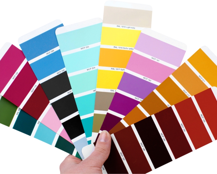
Using a limited color palette in your logo design is important to create a simple yet effective logo that represents your brand effectively.
Not Applicable to Other Marketing Materials
Not considering scalability or applicability to other marketing materials can also negatively impact a logo’s effectiveness. A logo needs to be designed in a way that can be easily scaled up or down for various applications such as billboards, business cards, and social media profiles.
A logo that looks great on a website may not work well on other materials. Failing to consider scalability can result in a logo that is difficult to read or looks distorted on certain marketing materials.
Wrong Font Choice and Font Family.
A font can communicate a brand’s personality, tone, and values, so selecting a font that aligns with your brand’s message is crucial. Choosing a font that is difficult to read, too complicated, or inappropriate for your brand can harm the logo’s effectiveness.
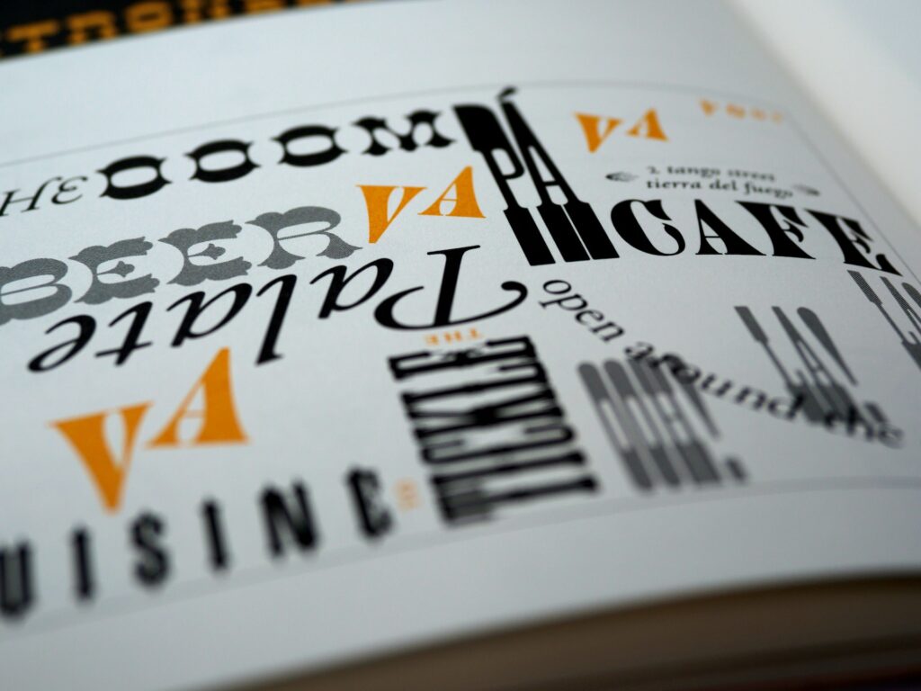
The wrong font choice can also make your logo look unprofessional and unpolished. Therefore, it’s essential to consider the font carefully and choose one that represents your brand’s message and resonates with your target audience.
No Originality – A Copycat
Copying another logo design can make your brand look unoriginal, uncreative, and lacking in authenticity. It can also result in legal issues if the copied design infringes on the original designer’s intellectual property rights.
To avoid this, investing time and effort into creating a unique logo that represents your brand’s message and values is crucial.
Ignoring your Target Audience
A logo should be designed with your target audience in mind, as it needs to resonate with them and appeal to their preferences. A brand must consider this primary factor to ensure effective communication of your brand’s message and attract the intended customers.
Therefore, it’s crucial to understand your target audience and design a logo that speaks to their preferences, values, and interests to attract and retain them effectively.

Too many design elements
A logo with too many elements can appear cluttered and confusing, making it difficult for customers to understand and remember your brand. Additionally, complex logos can be difficult to reproduce and look poorly on all marketing materials.
Creating a simple logo that effectively represents your brand’s identity and message is essential to ensure its effectiveness in the marketplace.
Let’s Create A Logo That…
Creating a logo is a crucial part of any branding strategy, and using an AI logo maker can help ensure it accurately represents your brand and resonates with your target audience, which is vital for building a solid and memorable brand identity.
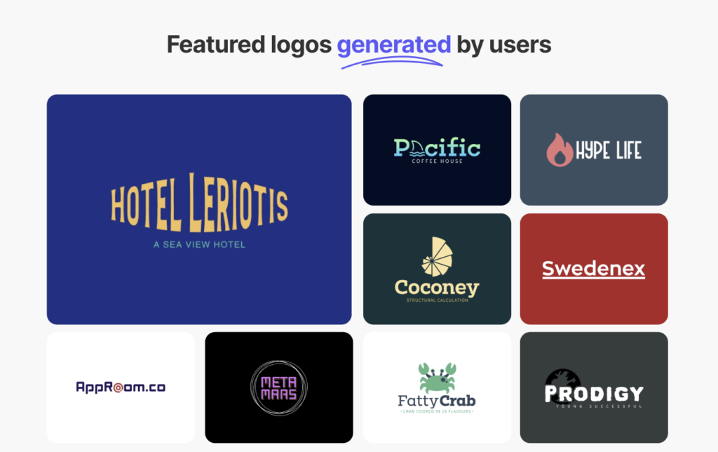
You can ensure that your logo is effective and impactful by avoiding common mistakes such as using too many colors, choosing the wrong font, not considering scalability, lacking originality, ignoring the target audience, and incorporating too many design elements.
Remember to take the time to research and understand your brand’s identity, audience, and competition to create a logo that stands out and represents your brand in the best possible light!
