As a business owner, you want to create a logo representing your company in the best way possible. You’ve been considering using the sprite logo, but you’re unsure if it’s the right choice.
If you’re wondering why someone might want to know all about the sprite logo, here might be a few reasons why this great lemon taste brand is pretty famous:
- The sprite logo is one of the most recognized logos in the world.
- The logo has been around for decades and has evolved.
- The different elements can communicate a lot of meaning and symbolism.
As a business owner, you know the importance of creating a solid and lasting impression, and you also understand that it’s not always easy to stand out from the competition. In this article, let’s discover how the sprite logo came to be and what other aspects and elements to consider.
Meaning and History of Sprite Logo
The history of the Sprite brand is a long and interesting one. The logo first appeared in the early 1950s, a brand for a soft drink called Sprite.
At the time, soft drink was an alternative to Coca-Cola in restaurants and retail. In fact, the original sprite logo was very similar to the Coca-Cola company logo.
However, over the years, the sprite logo has changed significantly. The current version of the logo is much more modern and abstract than its predecessor.
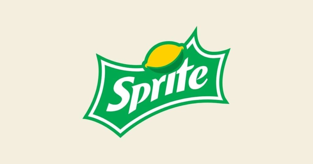
The different elements in the logo also have new meanings and symbolism. For example, the emblem’s green sphere represents nature or growth.
The Sprite logo exudes freshness at first glance. The color scheme and graphical elements of the brand’s badge depict the sparklines and lemon-lime flavor of the well-known beverage, demonstrating the company’s forward-thinking approach and attention to detail.
If you’re considering using this logo for your business, it’s important to understand its history and the different elements. This will help you to create a logo that is truly representative of your company and its values.
Sprite Logo Design Over The Years
1961-1964
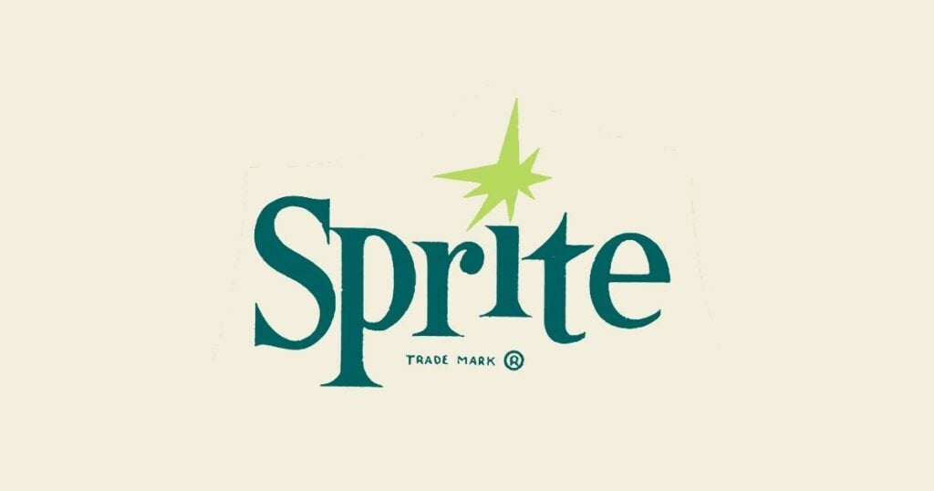
The 1961 Sprite logo featured dark green jumping letters with long, pointed serifs and was composed of green lettering. The dot above the letter “I” was changed to an eight-pointed lime-green star to match the letter’s angular contours and symbolize the drink’s lemon-lime flavor.
1964-1974
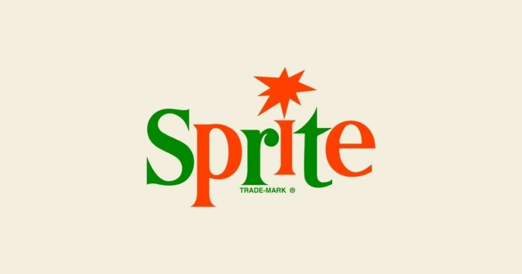
In 1964, the emblem’s color changed to red and grass-green, and the letters were divided into two halves, each with a different color. Along with the vertical bar of the “I,” the enlarged star also gained boldness and was given a red color.
1974-1989
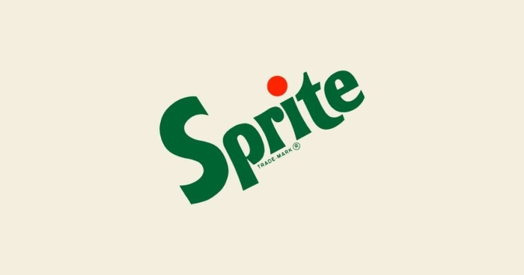
In 1989, the brand changed the iconic logo with the lemon instead of the dot. They positioned a two-layered lime and lemon image horizontally above the “I” in a bold, elegant light green font. This became one of the most recognizable logo variations of the brand.
1995-2003
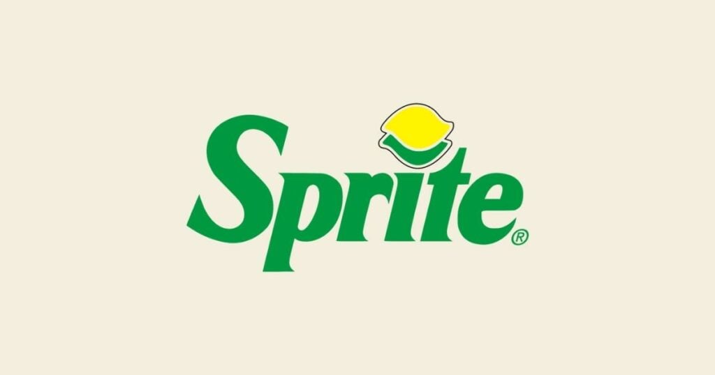
In 1995, the lime and lemon symbol was replaced by an abstract version of two solid circles overlapping. Sprite put the icon above the diagonally placed white letters on a striped green and blue background that went from light to dark. You can still see this badge on other countries’ beverage bottles.
2002-2005
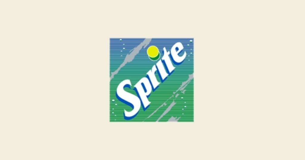
In 2002, Sprite slightly refined its logo to make the colors brighter. The letters became bolder, removing the two green and blue stripes from the background.
The wordmark’s typeface was changed to a more contemporary one, sharpening the angles and highlighting the edges. The thin blue outline complemented the body of the white lettering, a thick blue shadow, and some accents in the same color. The lemon-lime dot grew more svelte and fluid.
In the horizontal version, the letter shadows were a thick blue outline, and the icon above the “I” was a lime overlapping a larger lemon.
2004-2009
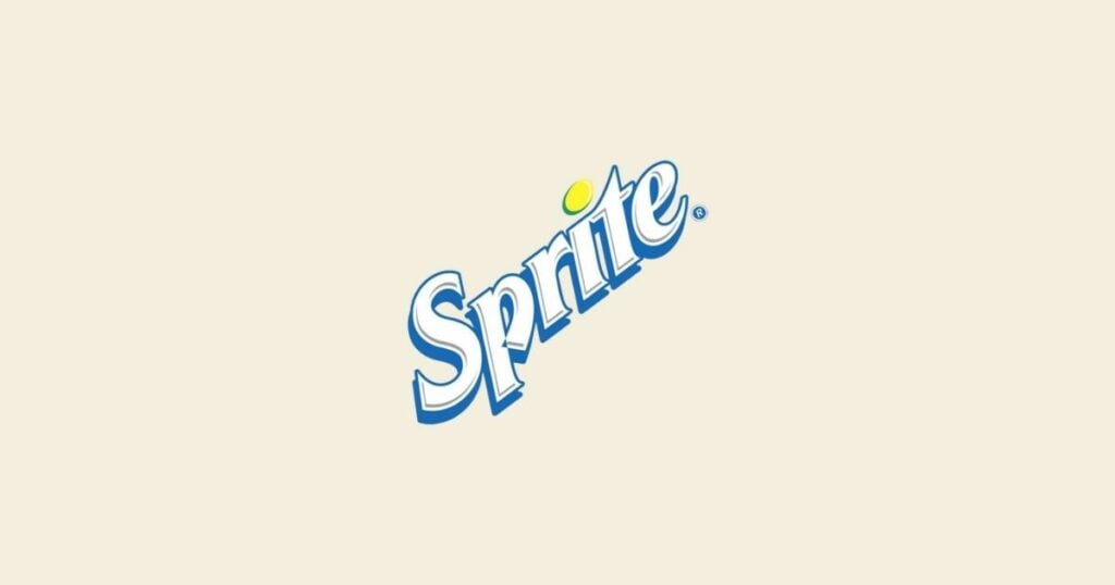
The 2004 redesign moved the Sprite badge horizontally, changing its position. The blue outline around the lettering had grown thicker, and the yellow dot above the “I” transformed into a lemon with a lime covering it. The brand also used horizontal drawings for the citrus fruits, and the inscription’s typeface was unaltered.
2009-2021
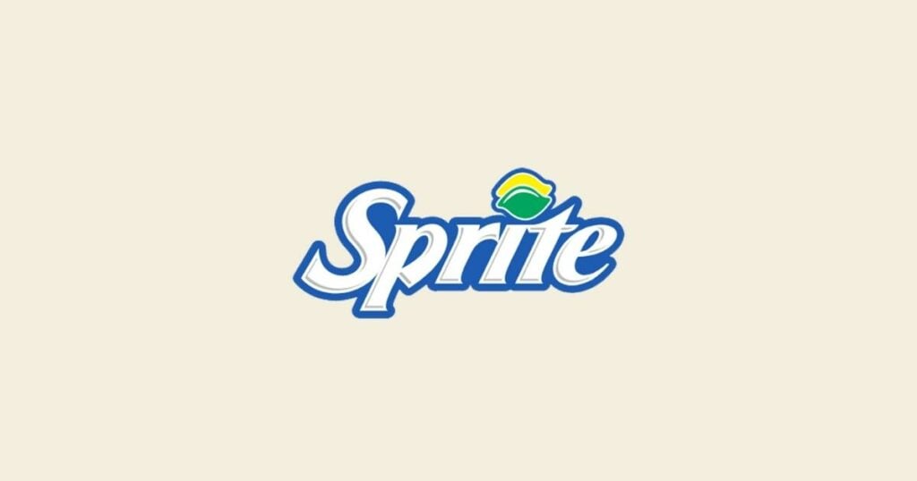
The wordmark was refined once more in 2008. They placed smooth white letters with a dark blue outline in a slick gradient badge with six-pointed angles and horizontal sides splayed to the center. Sprite also changed the dot above the “I” to an enormous lemon with a green bottom.
2022-Present
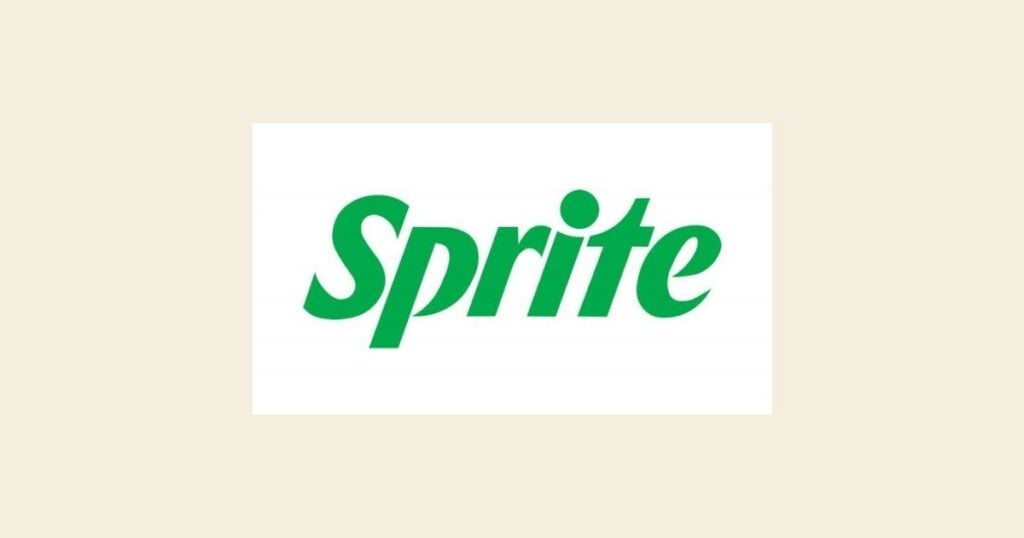
By using a single, horizontally positioned, solid green logotype as the only component of the badge, they simplified the Sprite emblem for 2022’s redesign. With only minor changes, the typeface of the new wordmark is very similar to that of the previous badge.
The dot above the “I” is now closer to the vertical bar, which makes the end of the bar look like it’s “smiling.” The top of the lowercase “R” also had a slight refinement.
Since 1961, as you can see – green has been the company’s symbolic color. In the same way, the orange is connected to Fanta, and red is connected to Coca-Cola. Green is also used to decorate the brand’s plastic and glass bottles, slogan, advertising, and marketing materials.
Grab a bottle!
The Sprite emblem underwent a lot of logo versions throughout the years. But one thing’s certain – with all those changes, it still doesn’t change Sprite’s quality and customer appreciation. Because no matter how much you transform your business’s emblem, you still have to keep it on-brand, simple, and memorable.

Sprite is the largest and most famous beverage company out there, and with its excellent lemon taste, who can resist a good, ice-cold, sparkly bottle to go?
Create an Iconic Logo For Your Beverage Business!
Have a business but don’t have a logo to represent it with? or better yet, don’t you have an inch of creativity in you? This is your sign to create logos in minutes with logo maker apps such as Logo Maker AI. From word to mascot logos, create clear and compelling designs for free.
All you need to do is to search for your niche, choose from hundreds of visual and design templates, and once you’re satisfied with the result, download it and save it as a png, jpg, or any other vector file.
Ready to make your business stand out?

