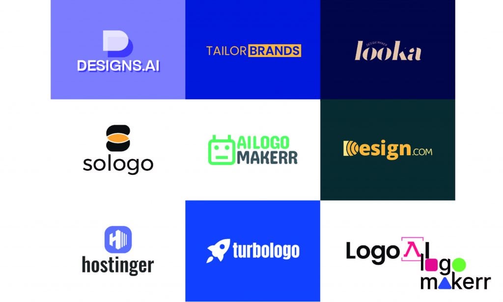
As an AI logo generator ourselves, let’s put our technology to the test by crafting fresh, new logo designs for the 10 best AI logo generators of 2025. We analyze four essential design elements—symbolism, font, color, and layout—to show how these new logos enhance the message delivery, evoke emotional responses, and sharpen market positioning.
1. Brandmark Logo
Original: A wordmark splitting “BRAND” in yellow and “MARK” in charcoal gray.
New: An abstract “crowd” icon beside a lowercase dual-toned wordmark.
The new icon suggests collaboration—three stylized figures forming a circle—whereas the original offered no visual cue of teamwork. The typographic shift from rigid uppercase to friendly lowercase, with rounded terminals, makes the brand feel accessible to non-designers.
- Color: Yellow transitions into the icon, balanced by deep charcoal for a blend of energy and professionalism.
- Layout: Separating icon and wordmark creates modular flexibility—icons can stand alone for apps, while the wordmark remains distinct.
The new Brandmark logo highlights collaboration and approachability through its symbol, typography, and refined color palette.
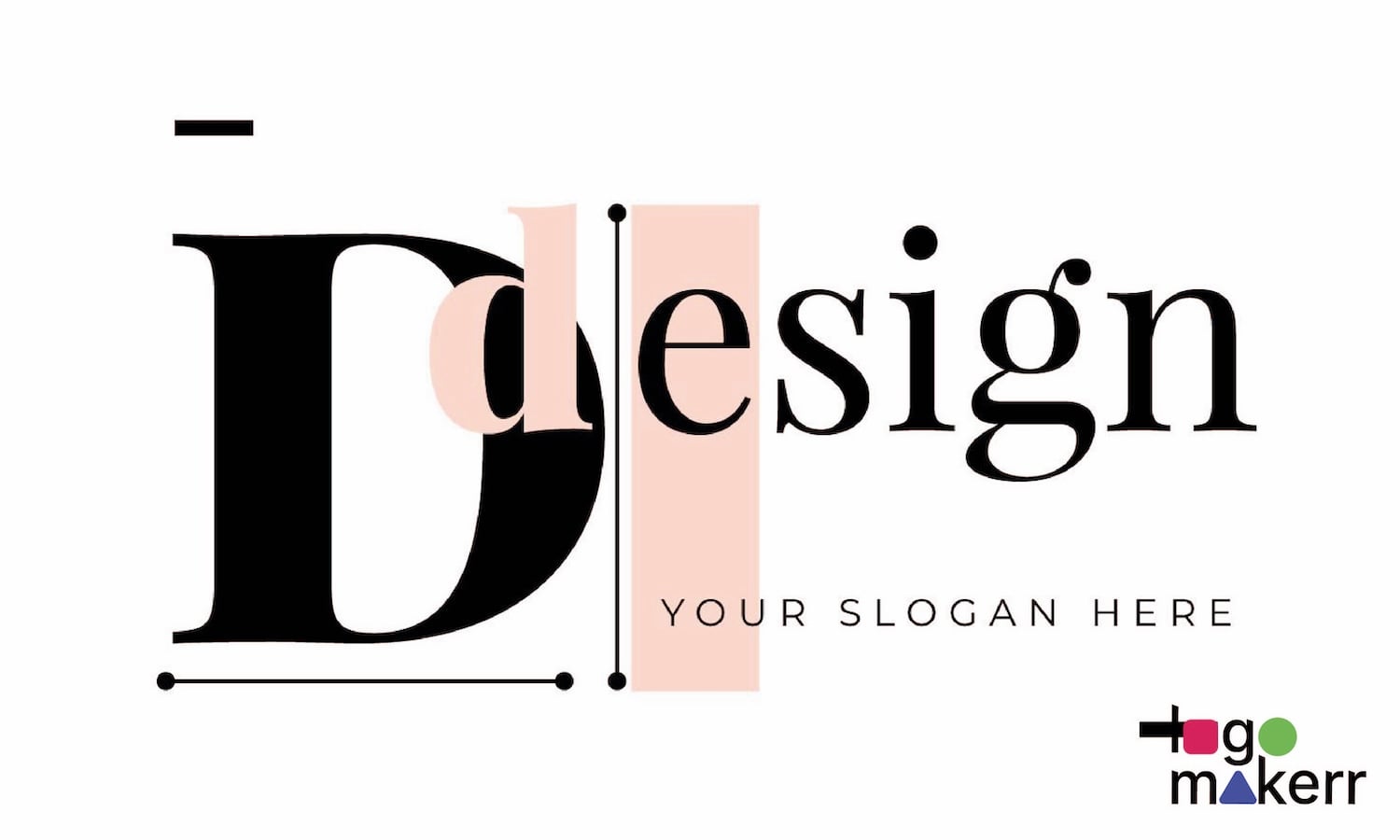
2. Design.com Logo
Original: A linear “D” monogram beside uppercase “DESIGN.COM” in black.
New: A sliced-circle icon resembling “D” in mustard-gold paired with bold lowercase letters on a dark slate background.
Concentric arcs cut into a square to reference both the letter “D” and a camera aperture—dual symbolism the original lacked. The thicker lowercase type enhances legibility and memorability at any size.
- Color: Mustard-gold on charcoal conveys sophistication compared to plain black.
- Layout: Centered within a colored block for a badge-like composition ideal for headers and overlays.
The new Design.com logo transforms its identity with distinctive symbolism and welcoming typography that stands out in a monogram-driven landscape.
3. Designs.ai Logo
Original: Gradient blue “DESIGNS” text with a circular “.AI” badge.
New: A two-toned overlapping “D” icon with white text on a violet background.
Overlapping shapes form the “D,” suggesting creative building blocks and adding depth via shadow—unlike the flat gradient. The move to solid white bold sans-serif text improves readability across media.
- Color: A unified violet backdrop ties icon and text together, boosting brand recall.
- Layout: Icon positioned above text within a rectangular “canvas,” mirroring the platform’s workspace.
The redesigned Designs.ai logo delivers maximum impact with minimal elements—perfect for social profiles, mobile apps, and watermarks.
4. Hostinger Logo
Original: Purple faceted “H” above an uppercase wordmark.
New: Simplified “H” with server-inspired vertical bars inside a rounded-square badge alongside lowercase text.
The icon now evokes a server rack’s blades to communicate reliability and stability—absent from the original monogram. Lowercase letters and subtle letter-spacing lend approachability to small businesses.
- Color: Retains brand purple, softened with white for strong contrast on light and dark backgrounds.
- Layout: Badge-plus-text structure supports both standalone app icons and flexible wordmark placement.
The updated Hostinger logo balances technical authority with user-friendly appeal, perfect for both novice and advanced users.
5. LogoAI Logo
Original: The logo consists of three bars which create a geometric form of the lowercase letters “A” and “logoai.”
New: A bright cherry-pink focus panel features the “Λ” (lambda) symbol along with bold lowercase text.
The logo symbolizes algorithms and code through the Greek lambda inside framing brackets while representing creativity through the lens or spotlight concept.
The new uniform sans-serif typography creates clear text that establishes trust with the audience.
- Color: Cherry-pink grabs attention and differentiates from the typical blues and purples of tech brands. The dark text element creates balance with the bright colors through its placement.
- Layout: The bracketed “A” symbol functions independently to provide flexible design possibilities for icon use and social media avatars and watermarking purposes.
The new LogoAI logo unites the abstract concepts of AI algorithms with creative framing elements to create a memorable versatile symbol.
6. Looka Logo
Original: The design features a hexagonal shape coupled with a stylized “L” monogram in blue.
New: The design features a sophisticated serif wordmark in deep navy blue with a small curved “Design Maker” label positioned above “looka.”
The original icon symbolized nothing more than the letter arrangement. The new design replaces the abstract symbol with elegant typography to establish Looka as an elite design collaboration partner.
- Typography: The implementation of contemporary serif typography with high contrast produces a stylish and warm visual effect. The logotype’s lowercase letters include ligatures that generate a natural sequence between words.
- Color: A unique combination of warm sand tones and navy blue creates an unexpected luxurious design aesthetic within the DIY logo space.
- Layout: The design of centered text with a curved tagline forms a traditional crest design that effectively showsheritage and trust.
The refined design direction of Looka logo makes it stand out from other DIY logo tools by focusing on craftsmanship instead of gimmicks to appeal to serious brand creators.
7. Tailorbrands Logo
Original: A red heart symbol sits atop two lines of text.
New: The logo features a strong yellow “BRANDS” block positioned next to “TAILOR” against a deep blue background.
The replacement of the heart symbol (which represented general warmth) with text-based lockup highlights both the platform’s ability to tailor solutions and its self-assurance in its brand solutions.
The design achieves visual hierarchy through the combination of standard and reversed colored text elements where“TAILOR” appears in yellow and “BRANDS” appears reversed on a yellow block.
- Color: The powerful yellow element creates effective contrast with deep sapphire blue and black/white text reversals provide better readability.
- Layout: A single-line format makes it simple to use in horizontal banner designs and navigation menus.
Tailorbrands logo presents an efficient and expert identity that delivers direct brand outcomes using clear typography and bold color blocks.
8. Sologo Logo
Original: The logo features an orange-swoosh icon alongside rounded lowercase text.
New: A stacked pill-shaped icon displays a charcoal background which holds a yellow center.
The new “S” symbol presents two interconnected forms which symbolize teamwork and relationship instead of the original random motion of a swoosh. The yellow center creates a spark of creativity.
- Typography: The rounded typeface remains to maintain a friendly feel while the darkened hue adds sophistication to the design.
- Color: Adding a dark charcoal background produces a sophisticated visual effect which counters the vibrant yellow element.
- Layout: The icon position above text creates flexibility for vertical placements including app icons and social media posts while maintaining clear visibility.
The updated Sologo logo achieves effectiveness while creating an unforgettable design which transforms an unmeaningful swoosh into an emblem that represents collaborative work with a central creative element.
9. Turbologo Logo
Original: The “Turbologo” symbol appears in plain black together with a multicolor diamond-grid icon.
A pure white rocket icon and bold white lowercase wordmark set against a vivid royal-blue block make up the new design.
- The rocket icon creates instant recognition of speed and lift-off which represents “turbo” perfectly. The design represents a concept that stands better than the basic grid design in the original.
- The shift from title-case text to thick lowercase text makes the design more readable and helps people recognize the brand.
- The text remains easily readable because of white text against blue background. The blue color creates trust alongwith showing technical competency.
- The layout contains both icon and text within one-color boundaries which creates an ideal marketing and UI design element.
The design works because the rocket motif strengthens Turbologo logo fast creation promise while the strong color and type elements boost visibility.
10. AILogoMakerr Logo
Original: The split design features green and black uppercase letters.
New: The design features a friendly robot icon that accompanies a two-tone lowercase logo.
The robot face serves to emphasize the AI engine yet presents a friendly neutral expression which displays both technical power and welcoming nature.
- The rounded lowercase letters harmonize perfectly with the curved design of the icon to create a cohesive visual brand identity.
- Color: A fresh minty green color replaces the heavier tone from the original design to fit digital standards while maintaining the balance of mid-gray.
- The icon-text combination exists as an independent unit which provides both horizontal flexibility and serves as an app or chat widget avatar.
The new identity of AILogoMakerr logo displays its AI nature directly and its welcoming personality helps non-technical users who fear technology terms.
Conclusion
The ten AI logo makers reveal multiple recurring design patterns that shape brand identity.
- The design transitioned from abstract shapes toward purposeful symbols that immediately reveal brand narratives through rockets robots and collaborative figures.
- The design evolution brought forth professional yet friendly wordmarks that use custom lettercases and strong serif and sans-serif typography.
- The selection of non-traditional colors including mustard and cherry and mint serves to make brands more approachable through distinctive design choices.
- Design systems with modular elements that include separate icon usage and wordmark adaptability provide design consistency between websites and applications and social media platforms.
The AI-powered tools display their quality through visual representation after designers use the lenses of symbol type andcolor and composition for each logo redesign. The new branding approach helps these platforms attract users who require immediate creative solutions without compromising their brand identity.