Healthcare is an essential safety need, but consumers can choose whom or where to receive this care. Whether you are affiliated with a hospital, a private clinic, a distributor of medical equipment, or a pharmacy, the right medical logo should promote your brand and make you trustworthy among your patients or customers.
Imagine you walk into a hospital to have some laboratory tests, and all the signage is excessively designed and hard to read. The last thing you want is for the patient to avoid the stress of finding the place for the procedure to be done right away.
Despite your professionalism, poorly designed medical logos can slow down the success of your venture. If you need to brand your healthcare business, you are in the right place!
Have a glimpse at the origin of medical logos, design tips, and what to avoid in making a medical logo design.
Medical Logo Origin
It’s been a long time since a new type of icon or symbol has been associated with the medical profession. But the most popular, and probably the default medical logo design familiar to everyone, is a serpent wrapped around a rod.
Interestingly, there are two versions of this symbol:
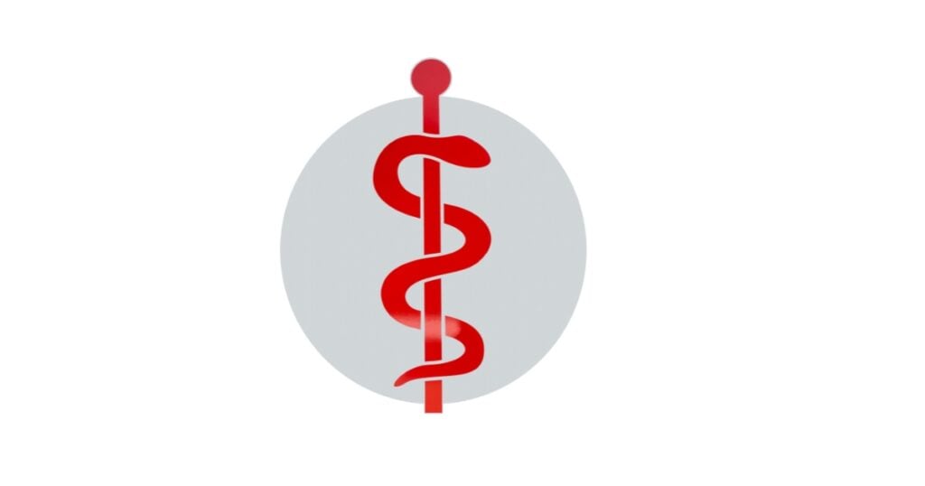
(1) Rod of Asclepius – A symbol of a staff with a single snake. Aesculapius, the Greek god of healing, used the snake as his cult.

(2) Caduceus – a symbol entangled by two snakes, sometimes surrounded by a wing. The caduceus is used as a symbol to represent Hermes in Greek or Mercury in Roman mythology. The symbol originated when Mercury attempted to stop a fight between two snakes, and he threw his rod at them, and both snakes entwined them around the rod.
Why Snake?
The resemblance between the two logos is a snake. Though a snake is a destructive creature, its shedding of the skin ability is analogous to longevity and immortality of life. At the same time, its sudden change of activity emphasizes transit from sickness to cure.
This logo was already the standard symbol often used in medical fields, whether in hospitals or by practitioners.
Modern Medical Logo
A medical logo is an essential brand identity for healthcare units. Several hospitals and health organizations made their logo available everywhere, on social networking sites, ambulances, billboards, medicine boxes, or on their website.
While a snake on the rod might be a general logo for medicine, you might consider having the idea through your profession.

Consider the message you want to impart to your consumers as you design your logo! A pediatrician may wish for a logo that says your child is in a safe, friendly place and can be treated or stay well.
Meanwhile, a cardiologist might want a design that can emphasize that he is a good heart doctor.
Essentially, a medical logo related to health and medicine should be made considering the specific health or market it is directed to. It is useful to entail graphic elements associated with the line of business.
A good medical logo is a must for a reputable medical organization to convey empathy, professionalism, and responsibility.
Design Medical Logos Perfectly
For those with zero knowledge or experience in designing a medical logo, or even a symbol itself, you may look for a medical logo inspiration or browse through the internet for a free logo template.
For instance, you can select from the thousands of templates available at Logo Maker AI, a leading AI logo maker. Just type in your brand name and choose from the ready-made templates created by Ai. If you need to tweak them according to your preference, simply click on ‘edit’ and freely customize.
The design ideas of a doctor, care, biotech, red cross, heart or heartbeat logo, pharmacy, and hospital are all great medical logo inspirations for references.

But if you want to create a medical logo from scratch, you can check famous toothpaste, healthcare, or clinic brands for more reliable medical logo ideas. You might also need a graphic design tool, like GIMP, PS, or AI, during the design stage.
But if you wish to make a customized design by yourself, consider three factors to come up with a well-established medical logo:
1. Choose an Appropriate Logo Shape
Hospitals or private clinics use shapes of crosses, hearts, hands, heartbeat lines, or other caring shapes that suit them. Deciding on what logo shape you will use will be the primary step in designing a logo.
2. Use a Common Font
Never try stylish fonts because these font designs won’t build trustworthiness. Instead, choose a fair, well-written, standard font as your medical logo typeface. For the font color, you may use a trusted color such as white, red, green, or blue.
3. Use Warm Colors
The overall medical logo design must assure the patients and other audiences that they will be provided comfort and warmth by their attendees or the place itself. Hence, it means selecting warm or hygiene-related colors during the design stage.

Every color has a different impact on customers. Blue is typically associated with being credible, trustworthy, knowledgeable, powerful, professional, clean, and calm. These qualities are highly valued in the medical community, so blue is the ideal choice for modern medical logos.
Precautions to Avoid Medical Logo Design Mistakes
Don’t rely on generic, too complicated designs or just plain. Explore your horizons to catch new ideas and avoid below mistakes:
Avoid Downloaded Content
Never use stock art or downloaded images when creating a logo. Your brand identity will be difficult to establish if you will copy the designs of others. Besides, copying designs from others is a crime; you must be unique to stand out.
Never go for Complicated Designs.
Most designers want to showcase their creativity but sometimes mess it up due to overly designed or complex graphics, negatively impacting viewers.
The audience may feel burdened and make them confused about where to keep their focus. This will make them less interested, and no business would ever like that.

As a general rule in every logo designing stage, a simple, engaging, and humanistic style will easily catch the consumer’s attention. Make sure to make a simple design.
Remember, less is more!
Do not settle for a Generic Logo Design.
Designers rely on common symbols to avoid complexity in design. But, this should not be your resort to avoid complicated designs.
You have to apply your skills and creativity at all costs.
For example, using medical tools like a stethoscope is already ordinary in the medical field, so you must refrain from using it to have brand and originality.
Health is very significant for everyone but keeps in mind that only some medical logo designs have to be serious.
The medical field is vast. Some industries that care for severe health issues may use a logo that brings calmness to the customer’s mind. Others use more graphic, colorful, and vibrant logos to keep the good health of everyone or to give emphasis as a distributor of medical supplies.