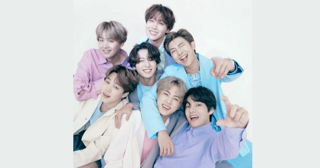
BTS is a famous seven-member South Korean Boyband with massive followers around the globe. The group members are Jin, Suga, J-Hope, RM, Jimin, V, and Jungkook, initially recruited and formed last 2010. But, the group debuted in the summer of 2013 by Big Hit Entertainment, with a music video of ‘No More Dream.’
The group initially aimed to focus on hip-hop music but is now engaged in different musical genres – and the bts logo is worthwhile. BTS shifted to pop music, with their song lyrics concentrating on current issues like mental health, self-love, individualism, troubles of school-aged youth, and loss.
The group has become a global phenomenon and is regarded as the most popular (or others referred as the best) band nowadays, breaking multiple streaming and sales records. Within six years, their popularity results in 16 albums and they keep gaining millions of followers and fans all over the world!
Thus, the group is continuously dominating the world stage, and no wonder their rebranding is always accepted and effective for their fans. BTS’ success is a long one, and the evolution of its music logo can simplify it.
Just like the band members, the BTS logo had undergone many changes to reflect the core of its members and fans.
BTS Logo Evolution
The band has four music logo designs, but only the second and third ones are used heavily on their merchandise. The bulletproof was the official band’s logo, but it was in 2017 that they introduced a new emblem featuring Army and BTS doors.
BTS Bulletproof Vest Logo (2013-2016)
BTS’ first logo was introduced simultaneously with their first album ‘”2 Kool for Skool”. The group’s name is Bangtan Sonyeondan, also known as “Bulletproof Boy Scouts.” Their bulletproof vest logo theme represented their fight against injustice and the firepower of their vocals.
The vest featured several illustrations along with the BTS inscription. The BTS font signifies military action. The logo also had a lightning bolt to emphasize the ‘firepower’ vibe. The lines around the vest gave a more comic appeal.
BTS’ 1st WINGS LOGO (2016-2017)
In 2016, BTS piloted a new Wings logo comprising four circles, and it became the cover art of their album with the same name. Many of their supporters assumed that the wings logo was just a random mix of circles and didn’t mean anything.
Eventually, BTS released a photo of each member, and the Wings logo represents each member in an abstract form.
BTS’s 2nd WINGS Logo (2017)
BTS modified the original Wings logo and highlighted four blue ellipses overlapping each other. The font also became bolder; it removed the round edge on the letters and added a tagline, “You Never Walk Alone.” This logo used a blue palette.
The Current Logo (2017-Now)
BTS released a new version of its iconic bulletproof logo in the summer of 2017. It is a simple modern black logo with two trapezoids representing doors opening from the inside.
BTS also changed its name from Bangtan Sonyeondan to Beyond the Scene. The designers chose black for the emblem, meaning sophistication through simplicity.
The typeface may also look like a traditional sans serif at first, but as you closely inspect, the letters have some modifications. “B” and “S” are in soft lines, while the “T” has a stylish effect.
The Beauty of Combined BTS and Army Logo – Symbol of Oneness
The BTS logo works well with the logo of its fans, the ARMY. The ARMY logo is also two trapezoids looking like a half-open door from the outside, implying that the fans are waiting at the door for the BTS Band.
There are two parts to the symbol. For BTS, the two trapezoids show the doors half open from the inside. The two trapezoids show the doors half empty from the outside for the ARMY.
The two trapezoids that make up the BTS logo look like doors, meaning “ARMY meets BTS at the doors.” The group’s official Twitter account says the logo shows “us and army coming together as one.”
Putting the ARMY half on top of the BTS half makes the whole symbol. The letter “ARMY” is at the top of the logo, and “BTS” is at the bottom.
The logo designers chose black because it’s a simple color that shows sophistication. “ARMY” and “BTS” are written in silver, which makes them shine a little.
At first glance, the logo’s font may look like a traditional sans’ serif, but when you look more closely, you can see that the letters are slightly different. The “B” and “S” both have soft lines, while the “T” has its top ends cut off to make it look stylish.
If BTS and Army logos are combined—it makes up a bulletproof shield, and it shows that BTS and Army becoming one can create an unbreakable force that can positively impact and change the world. This logo branding is excellent and made to surely last for a few years.
Final Thoughts on BTS Logo
K-pop groups have a pivotal role in Korean entertainment culture. BTS’ musical influence spreads across the world. From teenagers to young adults, BTS managed to evolve exquisitely. Indeed, they are one of the most successful boy bands.
With its distinctive font and color palette, the BTS logo is a model of contemporary brand logo design. Many companies, like BTS, will go to great lengths to ensure their logo is appealing and mysterious.
In fact, many products and manufacturers make use of the popularity of BTS logo to create a business-related to it, whether that’s a café, clothing line, or toy and souvenir shop.
Likewise, you as a business owner or formerly customer can create your own BTS logo type o branding that sets you apart from other small business in line.
Starting with Logo Maker AI, an AI logo maker, we can significantly help you in creating a powerful and well-thought-out logo design like the BTS logo.
With our logo builder, you can create unique logos for your brand in minutes. So, what are you waiting for? Bring your brand to life like dynamite!